JUST WHAT IT SAYS. THE KICKSTARTER IS GOING LIVE, AS OF JUNE 18, 2024
STARLOST UNAUTHORIZED KICKSTARTER IS GOING LIVE

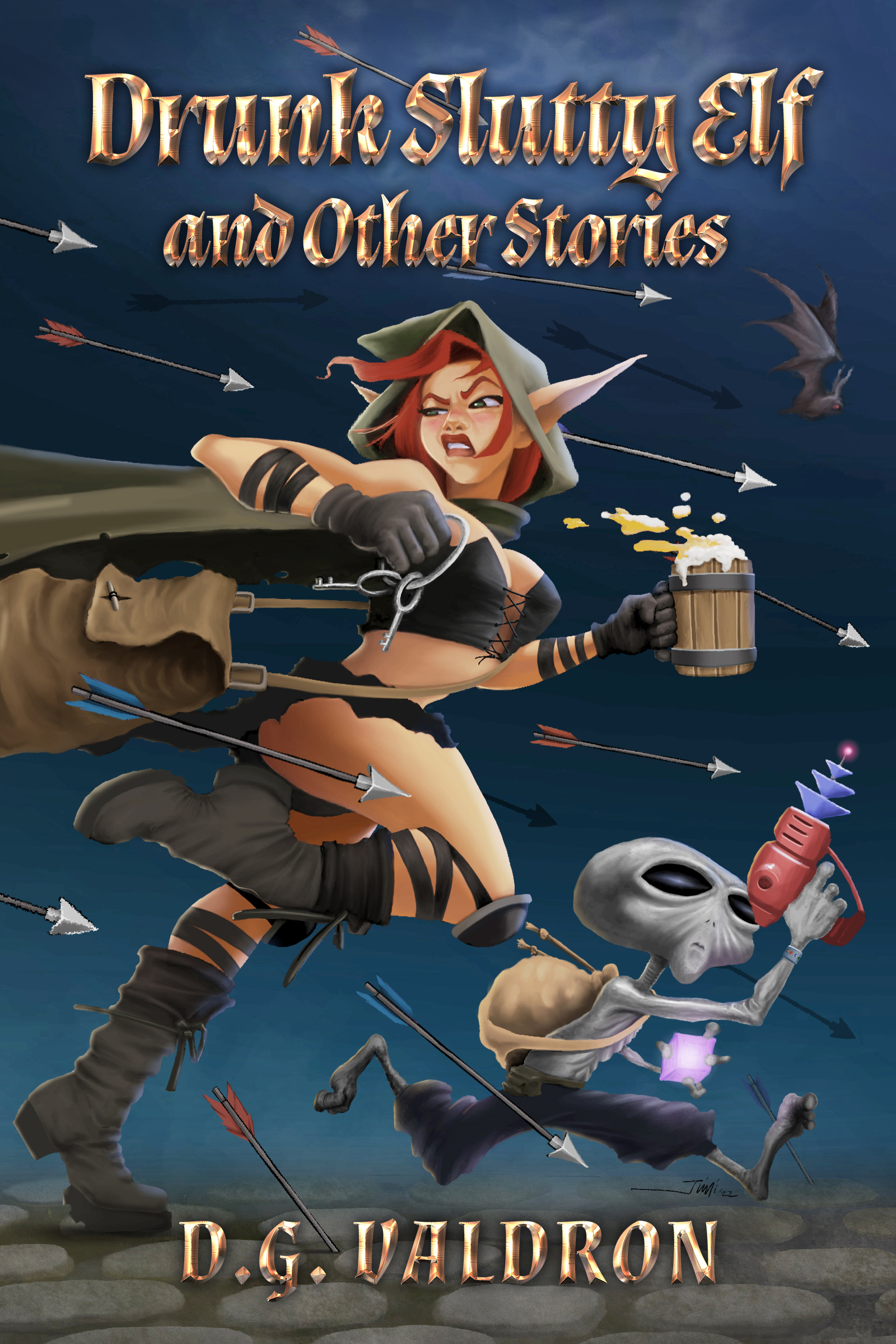
author of The Mermaid’s Tale, and other works
JUST WHAT IT SAYS. THE KICKSTARTER IS GOING LIVE, AS OF JUNE 18, 2024
At this point, I have published well over two dozen books for myself and other writers, and as a writer, I can say that covers are a pain in the ass.
So I thought I’d jot down a few notes to maybe help out other writers, including self publishers and people working with small presses.
Apart from either doing book covers myself, or being an active participant in the design of covers, I have a few other qualifications. Back in the day, when newspapers were laid out by hand, I was a production manager on small newspapers and magazines. Following that, I went on to design posters and promotional materials for stage plays, short films and arts and cultural events. As this was going on, I maintained a steady interest in art and audited art history classes. I don’t pretend to be some great authority, but I do know enough to make my way around a page.
THE CANVAS
In the old days, book cover design was pretty simple. Broadly, you had two sizes – paperback or pocketbooks about 4.5 x 6.5 inches, and trade paperbacks – loosely around 6 x 9 inches. Both had a width to height ratio of around 2 x 3. There was lots of variation, but those were decent rules of thumb.
The point being that you had a good idea of the space you had to work with, and the ratio you needed to work with, and subject to a little fiddling, you were fine. This may seem like mechanics, but the scope of the canvas dictates what you can and can’t do, or what works and what doesn’t work.
Now, however, it’s gotten more complicated. For books, we still have that 2 x 3 ratio, and pocketbooks and trade paperbacks. But now book covers are being presented in a variety of sizes, only some of which involve the physical books.
If you are browsing online Amazon or Barnes & Noble for instance, your first sight of the cover will be a tiny thumbnail, maybe 1.5 x 2.5 inches, and that first sight will be accompanied by a whole bunch of other similarly sized book covers competing for attention. That’s on a computer screen, if its on your phone, it’s even worse.
The key take-away is that for random online book browsing, your cover will be presenting under the worst conditions – a tiny image, with lots of competition.