OKAY – Here goes. You need a cover. You have no money. You can’t pay an artist. You have no talent, you can’t draw or do artwork. What do you do?
Well, you get sneaky. I was doing a book, B-Movie Monsters in Love! It’s just a personal project, it’s a fun book and I want it to be out there in the world. But I’m a quirky eccentric guy, and this is a really quirky eccentric book. So while I want it to be available, I don’t know that it will sell. At all. But I need a cover.
The Book’s theme is mainly deconstructing movie monsters. So that’s where I’m heading. I need a picture of a monster. Preferably a public domain picture, one without copyright issues. You can find public domain images if you keep your head around you and look around. Anything from the 19th or early 20th century can be fair game. We’re up to 1931 in the United States. Any image you can find that’s earlier than that is reliably public domain. Some of the stuff after that – from say Night of the Living Dead, or the Hideous Sun Demon is in Public Domain because the registrations got screwed up – you can get a screen capture from those. Or outside the US, the limitation period is 70 years after the death of the creator.
You can also buy ‘stock photo’ images with a legal license to use, from places like Alamy and Adobe. Some cover artists use them. I haven’t.
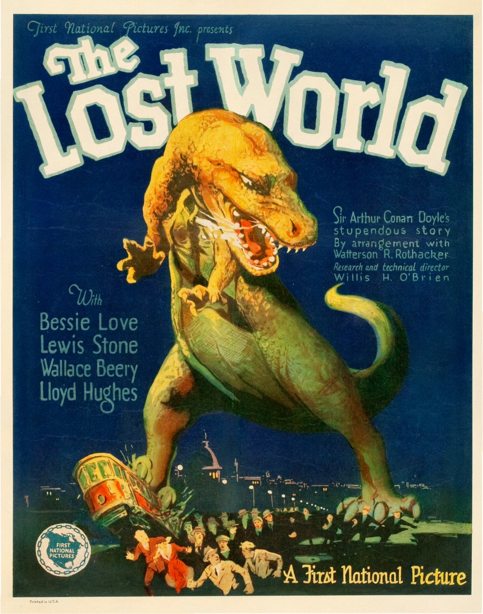
I poked around and poked around, and I found a really nice poster for the original Lost World, the 1926, Willis O’Brien stop motion animated film. Due to copyright registration issues, the film and its materials had gone into public domain long ago. This was safe.
That was my starting point. But I wanted to modify the image. Two reasons (1) The image is in public domain, so anyone can use it. If I modify it, it becomes a new work, and therefore I have copyright; (2) I only wanted the dinosaur, and the entire movie poster would be misleading. So, time to customize.
I went to a few free online photo editors. A lot of people use Canva. I don’t. No AI, I stay away from AI on principle. But even without AI you can remove backgrounds, crop, cut, adjust tint, contrast, brightness and texture, and do all sorts of neat things. I’m really very primitive with this stuff. I just keep blundering around trying things, adding and subtracting elements, using different online photo editors doing different things, until I get something I like. God help me. I don’t think I could ever do the same thing twice. But I usually have a very general idea, and I work towards it.
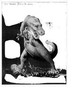
First step was to try and switch to black and white – that’s a nice golden dinosaur, I wanted something B-movie black and white. Then remove the background, which turned out to be easier said than done. Background removers are not that smart, so the titles and a lot of material remained. So I got out the crayon editing tool, and crudely erased a lot by hand until I had the dinosaur, and removed a lot of the extraneous material, the titles, subtitles, credits etc. This is sort of work in progress.
Okay, now I had my dinosaur. It was a bit stark. I started messing around with tones, brightnesses, balances and textures, working towards something that had an old B&W B-movie flair. I actually got a nice texture.
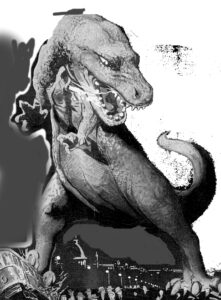
If you look around the dinosaurs mid-section – torso, belly and legs, there’s a kind of gray latex texture that put me in mind of a rubber suited critter. I cropped the picture now, making the dinosaur more prominent and deleting background I didn’t need. It still wasn’t right… too stark, so I messed around and managed to add a shadow on the left side. That was nice.
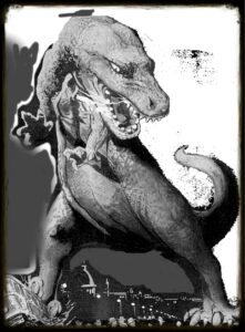
Next, I framed it, adding a border around it. Lots of options if you go lookng. I wanted a sepia border, kind of smoky and old fashioned to give it the look of an old-time photograph.
I had my central image, yay! Now I needed a setting and titles The dinosaur was too prominent, I needed to put a frame around it, with enough room for a title.
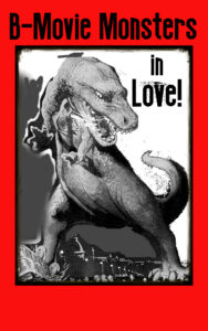
That worked. I actually mucked about with different titles and sizes of titles to see what would fit where. I was kind of struggling. I kept trying to think of variations on Monster, B-Movies, B-Movie Monsters, Creatures, Creature Feature… something with that kind of flavour.
Having ‘B-Movie Monster’ as the part on red, looked good, I found a cheesy font. It had that cheesy 50s Drive-in Vibe. Then I realized I could sneak part of the title into that hanging white space in the upper right hand corner. This allowed me to make my main title line larger and more prominent. ‘in Love!’ completed the look, a sort of visual dangler, particularly effective as the monster is looking right at it. It’s as if the Monster is reacting – it’s a B-movie monster, and it’s startled by ‘Love!’ I dunno, I suppose it’s silly and cheesy, but I liked it.
All that was left was to finish it, and … voila!
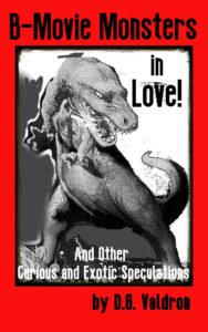
Now, a word about this particular style – this is part of my ‘Exotic Speculations’ series, which began with Dawn of Cthulhu…
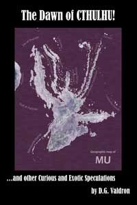
This is actually one of my very earliest books. Back then, self-publishing was just something I was messing around with to see how it worked. I had about 60,000 words of material which I thought was really nifty – including a long essay on Lost Continents, real and imaginary – which I considered of no interest to anyone but me. But I liked these stories and essays, they were sitting around in the hard drive doing nothing. So I thought… why not?
The cover image is an altered pacific ocean topography map (public domain) showing the sunken Zealandia Continent. Yes, Virginia, there really is a lost continent in the pacific ocean that sunk 20 million years ago. It’s 95% submerged, New Zealand in the south and New Caledonia in the north, as well as some Islands, are all that remains. A friend processed the image for me.
When I received it, it was green and blue. I photomanipulated it, reversing, solarizing and playing with the contrast until I had something vaguely disturbing and squidlike – appropriate since another of the pieces was about Cthulhu. Some asshole said it looked like a cumstain. But I thought it was distinctive – put a border and titles.
And since I had more essays in a similar vein, I did a follow up. The Fall of Atlantis.

Running with the theme of Lost Continents and mysterious places, the central image is radar topography of Greenland, as it would look without the Ice. That was the theme of one of my pieces. I tried to follow the look of Dawn of Cthulu. So central image in a box, same visual style.
I got the image off of Wikimedia Commons, which allowed free use, and they in turn got it off a Government Oceanographic Research site. Government is a good source, a lot of government publications and government created or developed images are public domain. Basically, if you’re looking for WWII stuff, or NASA type stuff, it’s a treasure trove.
In this, I was very nakedly following the look of books I’d read at the library when I was young: “Inside South America” and “Inside Africa” and “Inside Germany” by John Gunther. He was the Charles Friedman of his day, but intelligent and perceptive. He was basically a travel writer who visited these countries and gave you both a sense of what these places felt like and how they worked. His books visual theme was ‘box geography’ in a big frame.
Two books, I had a theme. A few years later, doing more exotic speculations – Murder Chickens on Mars, I went with that style. The framing box. My thinking is that it’s important that if you’re doing a series of any kind, the books should visually resemble and link to each other in some way. People should be able to look at them and instinctively group them together.
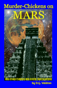
I had more experience, slightly, so I got a little fancy. Notice the electric blue border? The bright yellow text? The way the text intrudes on the images? Yeah, I was getting bold. But you can still see the structural kinship to Dawn of Cthulhu and Fall of Atlantis.
I also got fancy with the central image. This is actually a composite of three images. Remember NASA? Yeah, I got the starfield background and Mars from them. Laid the starfield on as the baseline. Then I added Mars, tilting it and moving it around until I had something I liked. Then I added the Pyramid.
The Pyramid is actually a real Pyramid. My ex-Anna, took a trip to Central America few years back, and visited one of the Mayan sites. This is one of the pictures she took, an actual Mayan pyramid. Of course, there were a lot of people in the frame milling around the bottom of the pyramid, so I cropped them out. I used a photo editor to remove the background, much easier on this one – basically sky. It wasn’t quite right, so I messed around, changing the colour, the texture and contrasts, giving it a more jade-like hue instead of the light coloured stone – it seemed more mysterious and Lovecraftian, and then I squeezed the image to make it narrower and taller. And voila!
Covers are always a challenge. One of my first self-pubs ever, I didn’t even bother. This was Lexx Unauthorized. The show had been dead for fifteen years. You couldn’t even find it on television, it had disappeared into the bowels of some corporate megaconglomerate and no one cared. I’d written a book, I thought it was a great book, and I was absolutely certain no one would care. I wanted it out in the world, just to be there. But I couldn’t justify spending money on a cover. A lot of books like this were dead plain. So why bother…

This started out as just a page on a word document. I simply wrote and centered the text, and played with fonts and sizes until I was happy. Then I discovered I could change the page background, so I went with dark gray. Changed the text to white. Made a pdf of the Word document. Made a Jpg fo the pdf. Not complicated, but I was happy. Honestly, I was just starting out. Actually managing any kind of cover was an achievement.
The truth is that I’m basically a writer. I like to write. I write lots. Lots and lots. Everything else is kind of secondary. But even then, I had this idea that if you’re doing a series, once you strike a theme, keep the theme.
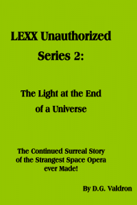

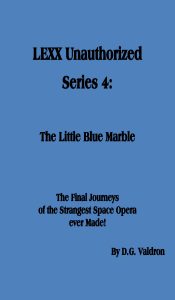
You know what? Even with these crappy non-covers, the Lexx Books have been small but steady sellers over the years. I guess its the subject matter.
I was similarly inclined when doing Starlost Unauthorized, but I got a little fancier.

This wasn’t a word document turned pdf turned jpg. Nope. The image is borrowed from NASA, so free to use. I think it’s the ‘Hand of God’ Nebula. Basically, I went to the NASA website and looked at all their nebulas and starfields galazies and whatnot until I saw something that clicked for me. That’s the background. I cropped and cut it to shape. The photo editor had a bunch of text options, so I just got fancy playing with the text until I had something I liked.
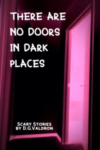
Here’s another one of mine. I was assembling my horror stories into collections. Back in the day, I was writing a lot of Horror. I had issues I guess. I’m better now. I ended up with three collections: Giant Monsters Sing Sad Songs, There are No Doors in Dark Places and What Devours Also Hungers I actually commissioned a cover for that one, and it’s gorgeous. But that blew my budget. So I had to economise.
For the second collection, I’d already made up what I thought was a terrific title – There Are No Doors in Dark Places. Gives you the shivers, don’t it? It’s a reference to depression, and to life situations, where you feel trapped and unable to escape. When you’re in the dark places in your life, it feels like there aren’t any doors – you’re just stuck with no way out.
I thought it was meaningful. The point is that the title gave me an idea of what I wanted for an image. I wandered around with my cell phone, looking for and taking pictures of creepy doors, doorways, entries, portals and whatnot. If I took the photo myself, I had copyright.
That’s a good trick by the way. If you can use or start with a photo taken by yourself or a friend, then youdon’t worry about rights issues. Unless, for instance, you’re taking a picture of a person, or of a copyrighted work.
Eventually, after wandering around for a week or two, I ended up taking a picture of my bedroom doorway in my hallway. Well, that’s a portal to hell for sure. Then I went into photo-editing, changed the image to black and white, reversed white to black and black to white and messed with contrasts and brightness until it looked stark. Then I changed it to colour, made it red-pinkish, but a very intense almost flourescent brightness, as if it was illuminated by a furnace. This was a nice stark image, which gave me a big black space on the side to put title and text in, in off-putting ways.
I’m still proud of this. It looks good, it’s stark, simple and elegant. The book never sold, oh well. But I always thought it was an excellent book – good stories, great cover. Oh well, win some, lose some.
You may if you wish, take my fondness for this cover as your proof of my lack of character, or lack of artistic skill or insight.
By the way, here’s What Devours also Hungers.

Photograph by Nancy Arksey, a friend of mine. Again, I lead with the title. The idea was of a predator, a hungry devouring maw. I asked her for some help, she sent me a bunch of pictures, including ones she’d taken of an old Trappist monastery. One of the pictures included a doorway with halls and chambers and windows, and this seemed to kind of fit the idea of a hungry mouth – the stonework made it look alien, this was a mouth, but not an organic jaws- the impression was of something unnatural.
I spent some time cropping the picture until I had it about right. Then I tinted it red, messed around with the contrast and textures until I felt it was creepy enough. Added titles and by-lines, and there you go. I like it. It’s a little abstract without being intrusive or obvious. The image supports the title, and you can look at this and know it’s not a romance or comedy.
For comparison, this is the one I commissioned and paid for Giant Monsters Sing Sad Songs:
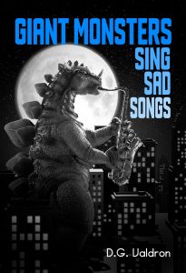
I will take credit, to the extent that I had the title in mind from the start, that I asked for a Godzilla-like Monster silhouetted by the moon playing a saxophone. I did not have the talent to do this all by myself. I don’t think it really fits with the visual theme of the other two books.
But that’s okay. None of the books sold. Nothing to do with the cover, it’s just that short story collections are a really had sell.
Here’s a cool one – mostly mine, but also a collab – Axis of Andes. These were my best selling books, by the way:

I designed this one myself, based on the pseudo-collage style of history textbooks when I was growing up. All the images are public domain, mostly from WWII, various government and historical archives. The marching figures in the foreground are actually from WWI – marching soldiers with the background removed and the contrast turned up to the point that they were just black silhouettes. the map of South America is from an old Atlas, with the countries photo-manipulated and recoloured. New World War used the same map, with different colours, the same marching silhouettes, and a different set of WWII pictures.
I had the idea, worked out the visuals, did some of the contrasts, tracked down the images. It was a bit beyond my skills so I hired a friend, Ewen Campion-Clarke to put it together as per instructions.
No, that’s not completely true. I suppose if I really stuck with it, I could have eventually sorted it out just like that. But Ewen’s father had died, he and his mum were grieving and cash was short. Ewen was a nice guy, so I commissioned him so he could have a couple of pro or semi-pro graphic design credits, and then I paid him twice the going rate. He passed away last year, same cancer that killed his dad. He was a good person.
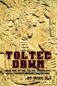
Another one of mine. But not my book. The story here was there was a guy named R.J. Hore, really nice guy. Friend of mine. He had a few books with a publisher called eTreasures. Unfortunately, they went out of business, so I went through a whole song and dance with him to get his rights back. Once we got the rights back, he asked me to publish them for him.
Well… okay. But here’s the thing. While he had the rights to his manuscripts, he didn’t have the rights to the original covers. We needed to come up with new covers. He had an alternate history trilogy about the Meso-American Toltec Empire conquering and occupying England – Toltec Dawn, Toltec Night and Toltec Khan. Plus another We’re Not in Kansas.
So we needed four book covers, three of them needed to be thematically related. No money, no resources.
Well, it was a historical trilogy inspired by Meso-America – so Aztecs, Toltecs, Mixtecs, Olmecs all that bunch. They’d left tons of friezes, bas-reliefs, statuary and relics around, many or most of the images of which were public domain. So I went hunting until I found Bas-Reliefs which seemed appropriate. Then I added a different colour to each, changed and intensified contrast, texture and brightness to try and make it striking.
I think it turned out okay, the books were distinctive, but at the same time you could see a unified visual theme in the art styles, with the colours contrasting each other nicely, and the same consistent high contrast visual starkness. I’m proud of them:
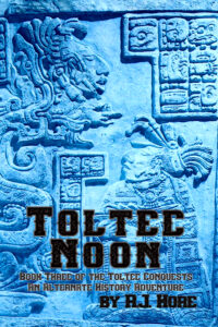
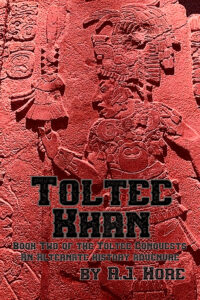
That’s about it. One more, technically not mine. Squad Thirteen. The book is mine, the cover is by Nym and Dean Naday. Basically, I started writing these stories about a group of Serial Killers called ‘The Squad.’ Dean was a big fan. He actually commissioned an artist, Nym, to draw freestyle pen and ink characters from the story.
Fast forward a few years, I was putting The Squad together as book, eventually titled Squad Thirteen. Dean took the drawings by Nym, solarized or reversed them, played with the exture, and assembled them together as a sort of collage. Eventually building a book cover out of it. It looked great.

This was my contribution, at some later point…
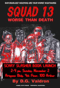
That red highlight effect in the figures, that ‘extra blood soaked’ look? That was me, playing around with an online (but not AI) photo-manipulator. I have no idea how I stumbled onto that. I couldn’t repeat it if you paid me money.
That’s about it. All the covers I’ve done or had a major hand in myself. Seventeen in all. There are others that were commissioned. The Drunk Slutty Elf books, and the Pirate Histories of Doctor Who, were two series commissioned from artists. Each series had the same artist for visual thematic and stylistic unity. For both series, I had very definite ideas of what I wanted. In one, I think it turned out well. In the other, not so sure.
Sometimes my ideas – as in Giant Monsters Sing Sad Songs are really good. Other times, not so much. It’s hit and miss. I’m not a genius, but I’m not illiterate. I spent time in production design for newspapers and magazines, so I learned about layout and directing the eye around an image. I’ve taken art and art history courses, spent time in galleries. I think I’ve got some basic ideas.
I don’t know necessarily that my covers are good. I may have simply proven to you that I’m a visually untalented idiot. Maybe. But I don’t necessarily think the things I’ve done myself are so dramatically worse or different than commissioned artists covers, that it makes much difference. Some of my personal covers may be better. Some may be worse. But regardless at least, they do the job.
I find that covers are fundamentally hit and miss. I have commissioned beautiful covers – that did nothing. I have commissioned expensive covers – that did no business. Some of my best sellers, Lexx and Starlost, are literally non-covers. Axis is a collage inspired by old textbooks. I’m not sure that there’s a formula for a good cover, or that anyone knows it. And even if there is a formula for a good cover, that’s not the same as a formula for a cover that sells your book.
I think it should be taken seriously. And I’d suggest investing in it to some degree.
But the reality is that most books don’t really sell. So as writers, we all have to face the fact that we won’t make back the money we spend commissioning covers, or the money we spend on editors or designers. If you’ve only got one or two books, and you’re well off, okay, spend the money. Take the loss, it’s for your satisfaction.
If you’re poor, then I can’t blame you for taking shortcuts, doing it yourself, and using the resources available. I’ll slag you for using AI. There are a lot of options and opportunities available for you to do a cover with a modicum of creativity and cleverness, enough sources and opportunities for images, and free photo-editing. You don’t need AI.
And if you’re like me… I write constantly, even pathologically. If I was commissioning high end covers for every single book, plus editing and all the other services… I’d be bankrupt. I’ve written twenty-seven books, published twelve more for other people. I’m always on the lookout for a cheap (no cost) basic image to fit or adapt to a cover. I have to.
In the end, I think I’ve done okay. But… you decide.